How to make a good looking output?

There are so many various features and techniques for rendering so I just feel lost.

Can you say what features and techniques should I consider for producing a good looking output, please? Like a brief tour. Nice models or terrain.
So far I know I can use anti-aliasing, better textures, more detailed models, some “magic” shaders, normal mapping.

I also know that what is made in blender is not completely what you get in panda3d, what can be done on blender level?

For instance, I want to make a limited terrain (so you can’t move far) with models on it and a sky.

That’s a really big question. My advice to you is the same advice I got from a book about comics.

All visuals exist somewhere in between two things: absolute realism, and absolute symbolism. A photo is an example of absolute realism. It perfectly depicts the reality of what is shown. A word is an example of absolute symbolism. It represents a portion of reality without actually looking like it at all.

Most video game art is in between those two. What you need to do is decide how much you want your art to realistically depict what it represents, and how much you want it to imply what it represents.

This is something cartoonists and comic artists especially need to consider, and since a video game is really just an interactive cartoon, video game artists need to consider it as well.

Using cartoons as an example, take the popular Japanese style of drawing faces, below.

This is a more symbolic representation of a face, with certain features given prominence over others. The eyes are one of the most expressive parts of a person’s face, while the nose on the other hand isn’t very expressive at all. For that reason the eyes are exaggerated and the nose diminished.

You need to make the same kind of decisions in your art. What is the art for? Are you trying to entrance the audience with the visuals, or tell a story, or something else? What portions of the art are most helpful to meet that goal? What portions aren’t really needed?

Answering those questions should help you decide on a visual style and tell you what details you really need and what you don’t.

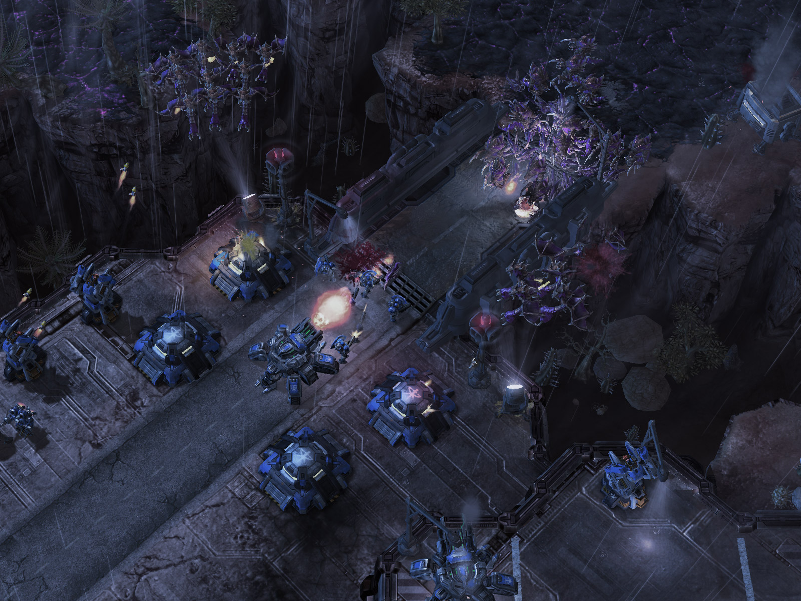
As for your questions about technique, Bloom can be excellent tool for adding richness to art. An example of that is the first area in NCSoft’s game “Guild Wars”. Glow and Gloss maps are also nice tools. Glow is particularly nice in combination with bloom, as in this picture which uses Glow, Gloss, and bloom.

Hopefully this will help you make good decisions for the artwork in your game. :slight_smile:

if you go for realism… there are a few things in semi-random descending order. (and this is my own humble experience i gathered during the last 10 years. depending on your feeling of reality the order might differ)

most important for realistic impression is lighting (this does NOT include dynamic shadows). especially radiosity or occlusion based allow the user to get a feeling of the deepth of the geometry.
on 2nd place i’d throw in the texture. as in plain diffuse texture as used sind anno dommini.
if you bake the lighting into textures, you can get quite realistic looking environments without any advanced hardware or shader magic.

now the rest of the things depend on your particular taste/game/environment.shadows, specularity, and normal maps can give a very good impression about the type of material and also fake a structure. the geometry, well. it’s rather unimportant, but the rough shape should match, for characters proportions are very important. animations are also a huge deal when it comes to realism. you can afford poor animations for prettymuch anything… except humans.
human brains are so used to human movements, even the tiniest strangeness will be noticed immediately.
most of those things can be done with either fixed-function-pipelines, simple shaders (autoshaders in panda), or the artist’s eye.

last but not least the “so called shader magic”:
bloom is an exccelent way to give an impression of brightness of something. the more bloom the brigher it is (for your brain), so sun, bright lights in a dim environment etc. under such situations you can fake a high contrast between light source and the rest of the scene, which is interpreted as something natural by your brain.

well i dont think i have to comment on such things as steep parallax mapping. they sure look nice but if your lighting fails… even those things wont save the overall impression.

conclusio: i found that adding baked lightmaps (radiosity/occlusion) to the scene/characters never hurt. no matter if toon-styled or aimed at realism. i always found it more pleasing to my eyes. Textures make… or break your model. and if your human-animations are well done. then things will propably look ok. maybe not next-gen, but at least no longer “programmers-art”-class.

Radiosity is definitely helpful for realistic lighting. Baking it into the textures for static objects in static lighting is great. For dynamic objects or dynamic lights, you can fake a bit of radiosity with low intensity gloss.

It depends entirely on what you are defining as “good”.
Are you going for a completely realistic look? A cartoon style? Something more close to a Pixar film?
You need to visualize what your end product looks like and work towards that using the least possible number of features.
If you don’t know where you’re going, any road will take you there.

Thanks for replies.

Currently making some sketches and looking for something similar. Well, StarCraft 2 looks similar.

us.media.blizzard.com/starcraft2 … -hires.jpg
I like the terrain and it’s dynamic lighting. And structures are good.

You might be able to achieve that dynamic lighting effect with glow and a bloom filter, but I’m not certain. Check out the free trial of Filter Forge (google it) for doing the terrain, Filter Forge is stupendous for doing seamlessly tiling textures. That will help you add the kind of gritty details you need to pull off that look.

Honestly, I’m surprised filter forge isn’t more well known. It’s one of the best texture generation programs I have ever used or seen.

Blizzard generally uses very basic graphics effects to achieve their style. What you are seeing there is diffuse, normal, and gloss map on the units and buildings. The terrain looks like 2 diffuse textures blended with vertex colors, and gloss map; I doubt there is a normal map on there. I imagine they might be using deferred lighting for the terrain but it’s impossible to tell. They do all of their little flares and glows with texture cards.

by now you would have realised that good looking output or bad looking output is not the fault of the engine, at least not entirely, even if so, it would be very minor

the crux of the look of any 3D game model is not the mesh, but the textures

one can have a model under 100 polygons but still have a great amount of detail, all because of textures, and i mean textures alone, no normal, specular or bump maps, no doubt they help but nothing beats the actual textures

the following link is probably one of the best examples of what i mean

http://www.game-artist.net/forums/seeking-employment/7036-freelance-low-poly-character-artist-seeking-paid-job.html