@Thaumaturge: I still don’t see it, sorry. Both feature a generic abstract geometric shape, yes, but the premise of Unity’s logo derives from the fact that it is formed by three arrows (presumably symbolising its deploy-anywhere mentality, which is pretty brilliant if you ask me), and not from the fact that it’s a cube. Besides the fact that the cubes have rather different projections, a cube is a generic abstract shape to be found in many logos, and certainly not the aspect that sets apart either this logo or Unity’s.
I certainly agree with croxis that it’s not worth fussing over to try and eliminate the cube from the design.
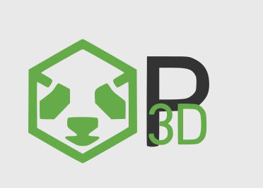
@ninth: I disagree we need to change the colour. Pandas are black-and-white, not green-and-white, so it feels weird to go with green.
@tobspr: Hmm, I’m not sure if I like the proposed change; I feel it takes away from both the cube look and the Panda look.
@croxis: works pretty well at 32x32:
![]()
@rdb: Hmmm… may be pandas is blue and white?  (looks at page header)
Point taken. 
I love it!
I think that this may be a situation similar to that of an ambiguous image, or the infamous black-or-blue dress:
I get the impression that when you two look at the Unity logo, you primarily see three arrows, and secondarily see a cube, and that when you look at the proposed Panda logo you primarily see a panda, and secondarily see a cube. Thus the two are quite distinct.
When I look at the Unity logo, I primarily see a cube, and secondarily see three arrows. The proposed Panda logo I do primarily see as a panda, but the secondary impression of a cube remains strong.
To me the difference in tilt and projection isn’t significant in differentiating the two, but this is quite subjective, I feel.
To my eye that looks far less like Apple’s logo than the proposed Panda logo looks like Unity’s.
But how many of those logos are for 3D engines, and how many share so similar a colour scheme? It’s not just that “there’s a cube”, but rather that in both cases the shapes are built around a cube, which is tilted, and which uses white and black (or dark grey) as the colour scheme. If the cube were a minor element, or the colour scheme were different, or even the cube were sitting on an edge rather than a point, I doubt that I’d be as concerned.
I do think that ninth’s suggestion of changing the colour scheme might help–but as has been pointed out, it feels a little odd to use anything other than black-and-white for a panda. (I’m not a huge fan of the current colour-scheme.)
And I’ve made my case for now. I hope that you are right, and do readily admit that I may well be wrong.
Very cool 
If I may make a observation, I personally feel that the selected font is not very " prominent ".
If you examine the Unity logo as posted above you , the text component is very " bold " and " impactful "
The suggested Panda3D logo, while being very nice , has text that is slim and is overshadowed to a certain extent by the surrounding whitespace.
I humbly suggest that any new Panda3D logo also adopt a " strong " font so as to be " eye-catching "
You’re absolutely right, I also noticed that ![]() In a new draft, I already started using a bigger font-weight, adjusting it so that it fits to the icon (Currently the icon is much more “solid” than the font, which is not how it should be), however I didn’t upload it yet
In a new draft, I already started using a bigger font-weight, adjusting it so that it fits to the icon (Currently the icon is much more “solid” than the font, which is not how it should be), however I didn’t upload it yet
Sounds wonderful
Oh and one last thing I did notice
In my humble opinion, in the " mockup " of the website, the hyperlinks to principal areas of the website are not emphasized very well, so as to immediately capture and guide the visitor’s " searching eyes "  to the really core areas of information and channels of communication.
In my humble opinion there is a slight information presentation and organization problem
One example that might clarify what I mean , the " Links " sub-heading is near the bottom of the panel and contains hyperlinks with names like " Internet Relay Chat " and " Secure HTTP Version " … all well and good if you are familiar with IRC , HTTPS etc. but for other persons it might be a bit sterile and even confusing and thus intimidating 
A more " visitor friendly " information organization might perhaps move the hyperlinks to and descriptions of available technical information resources and communication channels to a " learn and interact portal ", effectively a sub-domain of the website, and leave the marketing information on the " frontpage ".
This " learn and interact portal " would have hyperlinks to and descriptions of all major categories of technical resources and interaction displayed in a highly visible and very friendly manner, perhaps centered in a single page.
Basically in a single glance the visitor should be able to immediately identify the resources and interaction channels that are available to her, select the most beneficial for her immediate needs and go from there
A good example would be the Unity3D website where the " marketing fluff " is on the main page of the website and all learning materials and interaction avenues are found in a " learning portal " that really directs the visitor to everything important using very friendly descriptors and " calls to action ".
Admittedly this particular issue is a matter of personal opinion and the suggestions are highly subjective
Well its just demo content yet, its mainly about the design ![]() I just inserted some random links with no special meaning, and I took the long names because it looked better
I just inserted some random links with no special meaning, and I took the long names because it looked better ![]() I just wanted to demonstrate the design, the content will be different anyways
I just wanted to demonstrate the design, the content will be different anyways
No worries Tobias
I understand that its a " work in progress " and its a pretty good one at that
Take your time I am sure it will turn out great
I like the logos. Well, except the one with outward-poking ears looks a bit like autobot insignia! Otherwise, they’re great.
I’m less convinced about the website design. The tilted edges between sections drag attention to them, but the attention should be gently led to the content rather than the design. The size of the sections would require scrolling to get to the features. When I look into a SDK/library/etc website, what I really care about is seeing immediately the core feature set that I need. There should be immediate information about why I’d grab P3D over any other engine. That is, the selling points should be what the visitor sees first. I’m not personally a big fan of the auto-scrolling gallery elements; I’d rather see more information at once than have to wait (or randomly click) for the interesting bits. The combination of chosen colors of sections and the edge angles give a bit of a disorienting feel.
What I do like is the sense of minimalism and color theme. It looks very modern and professional. Separating links and changing elements from flat text and images is easy.
I do stress, however, that due to my extremely poor eye for aesthetics and emotionally challenged take on information digestion, I probably represent poorly the average website visitor in what goes to assessments of the enjoyability and informablity of websites. Overall, it’s not bad work at all!
Love the logo!
The site looks nice and clean as well. In general, a big thumbs up. ![]()
I’d agree - welcome blurbs are a bit of fluff. I’d like to see a getting started block of content instead.
I’d tend to agree, although a carousel would make sense if there was more a separation of content. Carousel for hero items that get changed on a semi-regular basis. (Think blog posts, releases, showcase). Features list below it.
I’d disagree slightly here - we shouldn’t be worried about users not scrolling, yes elements above the fold are where you put important items, but I don’t think we should cut down an already clean design just for the sake of limiting scrolling.
My suggestions:
I’m not sure about the off-canter horizontal bars - how would this look on larger screens? They’d have to stop somewhere? Unless that part was fixed width.
Maybe drop the second carousel and just have the features displayed, possibly in a grid. Its a bit less ‘mystery’.
I’d put a background colour behind the header - it looks ok with that photo (and I see you’ve tried to add more contrast with a text-shadow), but it might limit your photo choice. Also - how would that work on pages that aren’t the homepage?
Something like this, or alternatively the classic …

No fan of the transformers panda face. Too hard edged and looks stuffed. The green P3D text I saw is ugly and lacks any design, the first ones look quite okay but remind me a lot of nvidia.
The current logo is quite fine. Where does the need or desire for “rebranding” come from anyway?
Is there a valid reason?
It’s not just the logo, also the website.
As for the logo,
the original artist is gone, he hasn’t release any SVG, resolution is limited, colored 3d glasses on the panda’s head are old technology, and finally the gradient style of logos is getting old. You can notice that from logos to websites and whole operating system UIs people are moving away from gradients and glossy looks to more minimalist, usually single color styles.


This doesn’t mean glossy and gradient is worse, just that if we want Panda to look up to date to any new potential user we need to use a similar style for the logo and website.
There are probably other reasons for changing the website but this are few of the reasons I think.
Okay, at least you gave reasons.
Though the flat look people mistake as modern is horrible. When everyone does the same, the best choice is not to follow the bandwagon. It’s not “modern”, it’s “lack of independent thought”.
Good luck with this, though I still believe it’s not necessary. The logo is very individual and a nice contrast to all the boring , mindshared crap out there. What makes a winner is not the same lack of creativity, but being a contrast that stands out.
Well everyone can have their opinion. And I can agree with you. But it’s not about opinions, about what is modern, what design is right or wrong, or what looks good or bad, all this is subjective. It’s about appealing to as many people as possible, since community driven open source projects need as many people as possible to survive. And statistics and practice shows that’s the design the majority find appealing at the moment. Being unique in this sense isn’t that helpful in maintaining a project.
Well I can’t disagree here and after re-reading my post I apologize for my harsher-than-intendend tone.
It’s all good, I see where you’re coming from. For some of us same style on everything can get boring, but if that’s what the most like then that’s what we should give them.
Hello guys!
I’m new here, but I just wanted to share my enthusiasm for re-branding the website (essentially the whole engine).
Thus I wanted to ask if there’s still talk and or progress regarding this topic?
If anybody’s still interested I would be happy to share my thoughts and feedback.
PS: I found Panda3D by referral from a friend and if he wasn’t so enthusiastic about it, the website would definitely not have helped keeping me interested.