


I think part of our problem here is that pandas are cute and cuddly, and nobody wants a cute cuddly 3D engine.
they can be agressive…from wikipedai “Though giant pandas are often assumed docile because of their cuteness, they have been known to attack humans, presumably out of irritation rather than predatory behavior. Research shows that in cases in which its offspring may be under threat, the panda can and often will react violently”
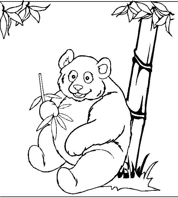
IMHO, this panda looks better (5min hack job) :

A panda showing its teeth could be at the same time seductive and dangerous-looking…
about the site :
- please no more fixed-width ! 100% width is much more useful.
- no more menu, they are APITA (for opening tabs)
- less color.
- no screenshot of example (in the right column) without source-code.
- a different gallery just for show.
heh that is actually is better! LBarret, good job!
I will redraw my panda to match yours next time i am in windows.
what about this logo? 
site needs a redesign should we all submit designs and see which is better?
I like it better with the tooth and mouth looks more mischievous and lively.
Its simple design makes it nice and easy to recognize at small sizes and that also helps.
wtf lol
cute panda!
make some thing better common! some thing worthy of this engine the current site is crap.

woulda done a 3d render but it sucked

sure it looks like someone got shot over it…
waaaah… murder!!!
flees 
Regards, Bigfoot29
common people panda3d is not bout killing better layouts and logos plz!
new logo:

made by faxmaster
what do you guys think?
No, I like the one with the teeth better  This one looks too cute too.
more layouts:

tell me what you like and what you dont i will try to incorporate that into design, also here is the GIMP source treeform.p3dp.com/pandasite/p2d.xcf - play with it
The jungle in the banner doesn’t look all that bad - no a bad decission. 
Things I would dislike:
- Everything is too big. Too big font size and graphics
- The Panda face is somewhat misplaced - doesn’t look like “massive power”

- The Banner itself doesn’t reveal much of easy usage and 3D capatibilities on the “visual” side. Looks more like a clan-homepage (computer game clans)
But thanks for the suggestions.
Dunno how far the design works inside of ETC did grow… (Josh?)
Regards, Bigfoot29

The text in the upper left box can be changed but it should be something snappy to grab the attention of users, something that tells them right at the start the benefits of using Panda.
The image viewer at the left of this auto scrolls to show more screenshots, the buttons probably ought to be smaller.
Can we please have an actual community wiki? It could make the life of new users much easier by having any code/how-to that is posted on the forum being easily available in one page. It might even supersede the official manual.
Uh, ignore the suck of the download button, it’s just a placeholder to show how it would be placed to grab the attention of users.

The content ought to be stretched all the way or another column should be put on the right to fill the empty space. No idea what though, I don’t quite like the idea of having the three random screenshots again.
Alternate logo:

Originally I had Bell Gothic as the font and I was kinda despairing because it looked good but all I had were non-commercial trial versions of the font. Then I found Florida Project and besides looking great, it ties into the history of Panda quite neatly!
Anyway, alternate version of the logo. It reads better but is less interesting than the one I’m using in the mockups.
These are mockups based on the current design, I’ll try doing another one with a different direction.
Also, treeform’s panda is the win but It was kinda anglular for my taste so I retraced it.

Ok, this is just my very own oppinion:
1st of your versions is far too overloaded. The second one suits much better.
However, I wonder if the screenshots could be placed to the right (as they are placed now)
Would be interesting as well if final layout would be fixed width or not…
But besides that: The Panda has something. It is not showing the “3D” aspect the current panda shows (due to the 3D “glasses” he is wearing) but it definately is WORTH a look. Great work there.
But due to the fact that I do neither speak for ETC nor for Disney, I am not sure if they want to change that Panda at all…
But to sum things up: I really could live with the second draft of the website design very well… good work.
Regards, Bigfoot29
ZeroByte good work!
I like what you have done to the logo. And i like the first page as a home page, while the second one will be used for forums and docs.
I think the blue clashes with the rest of the colors on the site.
There is space on the second page on the right where images can be put
I think the last header you have is easier to read.
Do you think the header needs to be resizable? You have an plane area in between so its easy to do this way the page will always be 100% of the width of the browser?
Also the gradients are a bit over used now but it looks like you used them correctly good job. I am waiting for the next iteration